

Hummingbird Heart Co |
Non-Alcoholic Bottle Shop
Brand Strategy · Brand Identity · Art Direction · Digital
The Challenge
Repositioning a wellness brand to build
recognition, trust, and community.
Hummingbird Heart Co. had outgrown its original visual identity.
The old logo created an immediate perception problem—it made people think the business was a jewelry store, rather than a non-alcoholic bottle shop, dry elixir bar, and apothecary.
The website created a second problem: instead of building confidence in the business, the experience felt inconsistent and lacked the visual credibility needed to establish trust with a new customer.
The brand needed to look as legitimate, intentional, and established as the business itself.

THE STRATEGY
Before designing the new identity, I looked at who the brand needed to connect with, what they valued, and what could prevent them from trusting the business.
The audience was centered around health-conscious, environmentally aware consumers interested in holistic wellness, mindful living, sober curiosity, sustainability, and supporting local businesses.
The strategic direction became:
Build trust.
Create belonging.
Educate without preaching.
The brand's existing values—community, sustainability, holistic healing, authenticity, and conscious consumption—became the foundation for the new visual system.

FROM STRATEGY TO IDENTITY
A visual language rooted in healing, alchemy, and a little bit of rebellion.
The creative direction combined vintage warmth, earthy color, natural textures, and playful “Sober AF” messaging to make the brand feel welcoming rather than clinical.
The resulting visual language was designed to feel:
HEALING · SOBER AF · VINTAGE · EARTHY · ALCHEMY
The logo system
Rather than relying on a literal hummingbird—which competitive research showed was common among brands using “hummingbird” in their names—I developed a distinctive healing-rune-inspired mark. It could function independently at smaller sizes and also become a recognizable pattern element across the brand.


Logo
System

BUILDING A BRAND SYSTEM
The identity wasn't designed as a single logo.
I developed a flexible system of:
Primary + secondary logos · Monogram · Badge · Logo mark · Custom icons · Patterns · Typography · Color system
The system was built to maintain recognition across different sizes, formats, and customer touchpoints. The final guidelines document formalized the logo suite, color combinations, typography, and usage standards.
Art Direction
Making the brand feel like an
experience—not just a product.
Photography direction focused on alchemy, vintage charm, wellness, sustainability, and community.
Rather than relying exclusively on polished product photography, the direction called for a mix of natural lifestyle imagery, tactile details, people, products, and the physical environment.
This allowed the brand to communicate the feeling of walking into Hummingbird Heart—not simply what it sells.
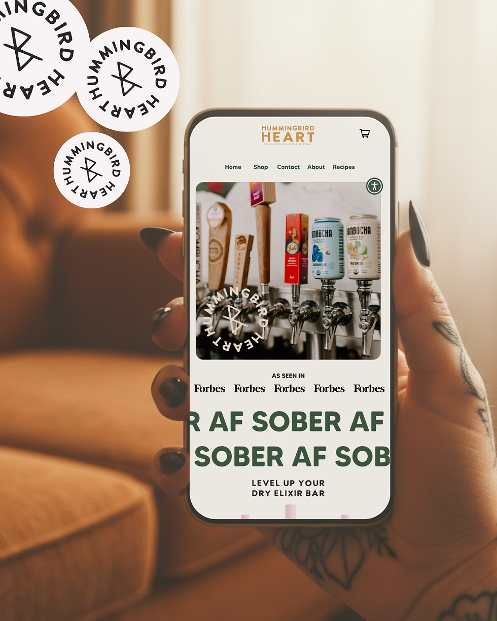
DIGITAL EXPERIENCE
Turning the new perception into a customer experience.
I translated the new brand strategy and identity into a Shopify website designed to feel credible, cohesive, approachable, and easy to navigate.
The goal was to make the online experience feel like an extension of the physical brand—not a separate storefront.
Brand Touchpoints
The system extended across the customer journey, including:
Shopify · Social Media · Business Cards · Advertising · Signage · Packaging Applications · Printed Materials
The brand guidelines were also developed as a practical system for maintaining consistency as the business grows.


